Simplifying the Irish Tax Filing Experience: A UX Approach to Reducing Digital Anxiety
Project Overview
This project was completed during my MSc in UX & Service Design as part of a multi-phase brief on real-world problem spaces. I chose to focus on digital public services, specifically the experience of filing taxes online through Ireland’s Revenue platform.
Through desk research and user interviews, I explored why many people feel anxious and overwhelmed using online tax systems, and I designed an e-learning concept app that breaks the process into clear, step-by-step tutorials to build confidence and tax literacy.
Role: UX Researcher & Product Designer
Context: MSc UX & Service Design (Individual Project)
Focus: Research, problem framing, concept, flows & UI
Tools: Figma, Miro
The research phase focused on understanding why users experience anxiety and friction when interacting with digital tax platforms, particularly within the Irish public services context. The aim was to uncover not just usability breakdowns, but the emotional, knowledge-based, and trust-related barriers that prevent users from completing their taxes with confidence.
SECTION 1: Research
Methods
To build a realistic picture of the problem space, I used a mixed-research approach:
Desk research into digital public services, tax literacy, and financial anxiety
Qualitative user interviews with Irish taxpayers
Review of existing online tax tools and support resources
Thematic synthesis of user feedback
Key Findings
Several consistent patterns emerged across research:
Users associate tax systems with high risk and fear of making irreversible mistakes.
Platform language and form structures are designed for compliance, not comprehension.
Many users rely on external help (friends, accountants, online forums) instead of internal system guidance.
There is high motivation to self-file, but low confidence once users encounter complex forms.
Prior negative experiences strongly influence future avoidance behaviour.
These findings revealed that the challenge was not purely technical usability, but also deeply tied to trust, cognitive load, and perceived financial risk.
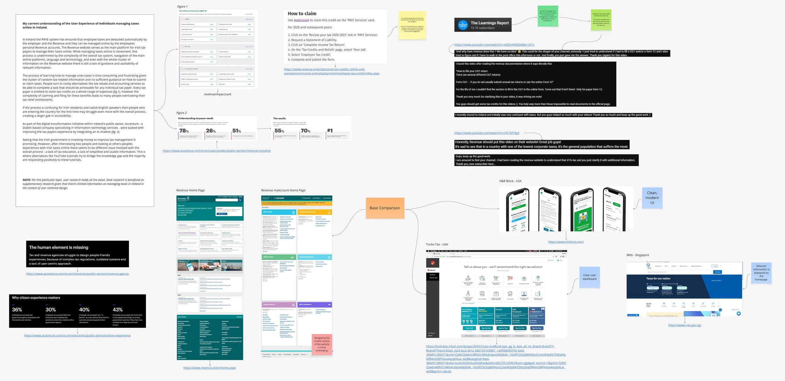
Desk Research - Exploring the area online tax filing in Ireland
Managing taxes online through Ireland’s Revenue platform is convenient in theory, but in practice, users often feel overwhelmed by the complexity of the system. Desk research revealed several pain points: unclear language and terminology, poor guidance, scattered information, and a general lack of educational support on how to claim entitlements or submit returns.
User Research - Exploring the area online tax filing in Ireland.
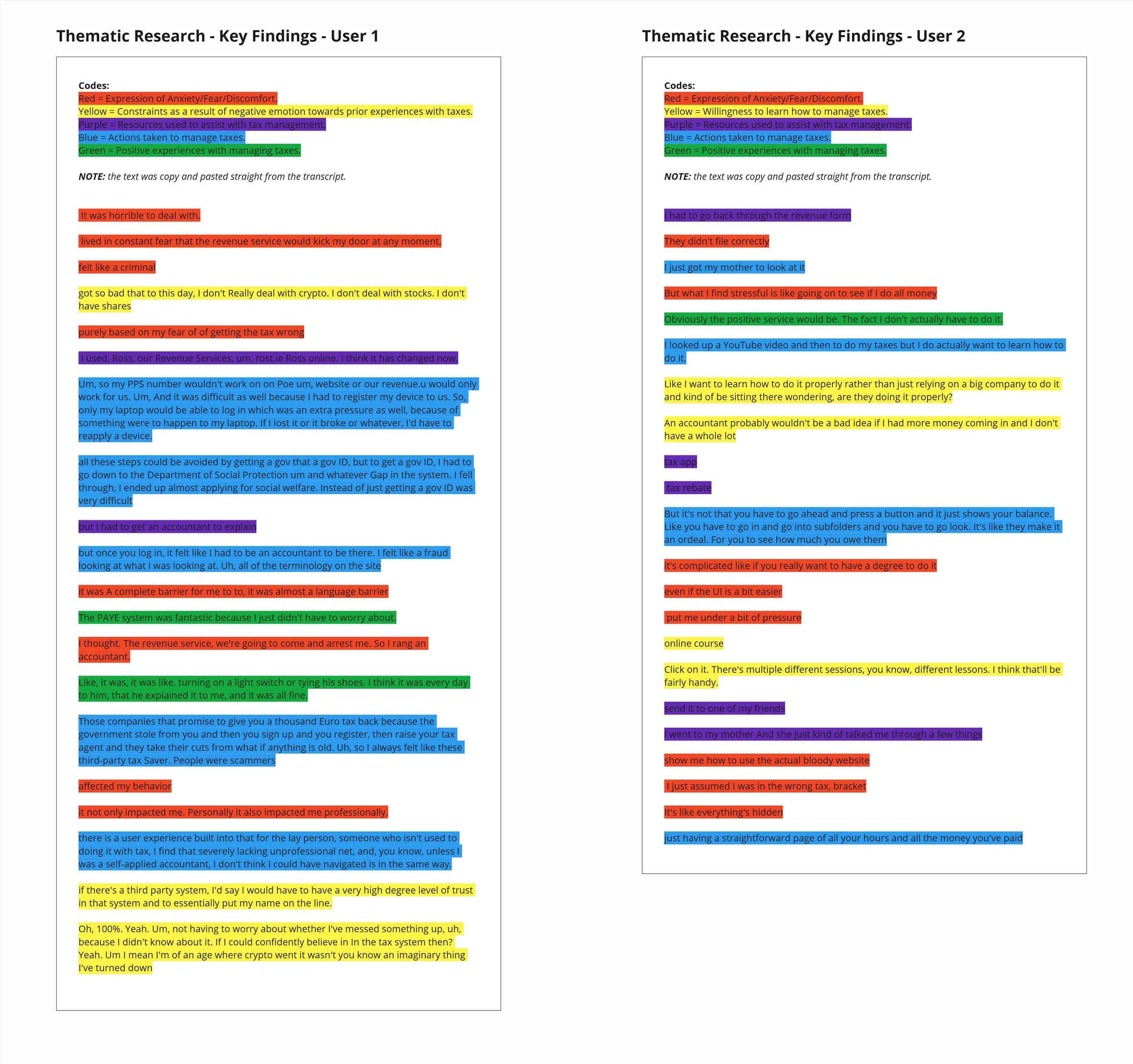
Interview transcripts were coded and synthesized through affinity mapping to surface shared emotional, educational, and systemic pain points.
What you see here is just a summary of key findings from the interview transcripts
Affinity Map - Data from User Interviews - "What are the main challenges experienced by people in Ireland with managing their taxes online?"


Emerging Themes
The findings from the Thematic Analysis of the interview transcripts and Affinity Mapping have formed three key themes:
Financial Education - lack of literacy, lack of financial education support.
Emotional Response - frustration and anxiety around managing ones taxes.
System complexity - time consuming, lack of accessibility.
Across both desk and user research, consistent patterns emerged around tax language complexity, lack of step-by-step guidance, and overwhelming user journeys on Revenue’s platform. Some expressed uncertainty and resorted to costly third-party services despite being eligible to file or claim independently.
SECTION 2: Problem Definition & User Needs
Irish taxpayers who manage their taxes online, particularly those without financial or accounting expertise, frequently experience anxiety, low confidence, and fear of making costly mistakes when using digital platforms such as Revenue’s myAccount and ROS. While these systems are functionally robust, they often present information in complex, compliance-driven formats that are difficult for non-expert users to confidently interpret and act upon. As a result, many users feel overwhelmed, make avoidable errors, or become increasingly reliant on external help.
Guiding Question:
How might we support Irish taxpayers who feel anxious about online tax management by providing step-by-step resources that break down the filing process, helping them feel informed and secure in using digital tax platforms?

User Person
To keep the design user-centered, I created a primary persona based on common themes across interviews — someone anxious about tax management but motivated to learn if given the right tools.

Customer Journey Map
The journey map was used to identify where users feel the most friction and where timely, step-by-step support could have the greatest impact on confidence and task success.
Based on the core user pain points identified in research - low financial literacy, emotional stress, and system complexity, I proposed an e-learning companion app that delivers short, step-by-step tax tutorials. The goal was to reduce cognitive overload, improve tax literacy, and build user confidence through guided, task-focused learning rather than forcing users to rely on complex government interfaces alone.
SECTION 3: Design Direction
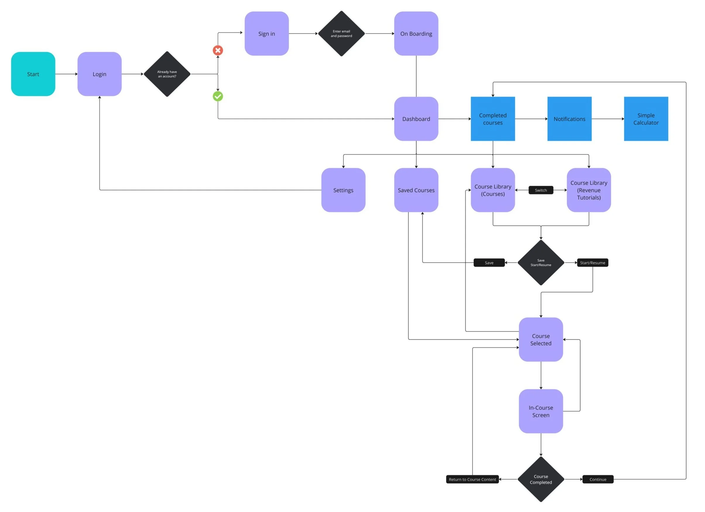
User Flow Diagram
The user flow maps the full journey from onboarding through course completion, focusing on how users discover relevant content, track progress, and return to tasks without losing context.
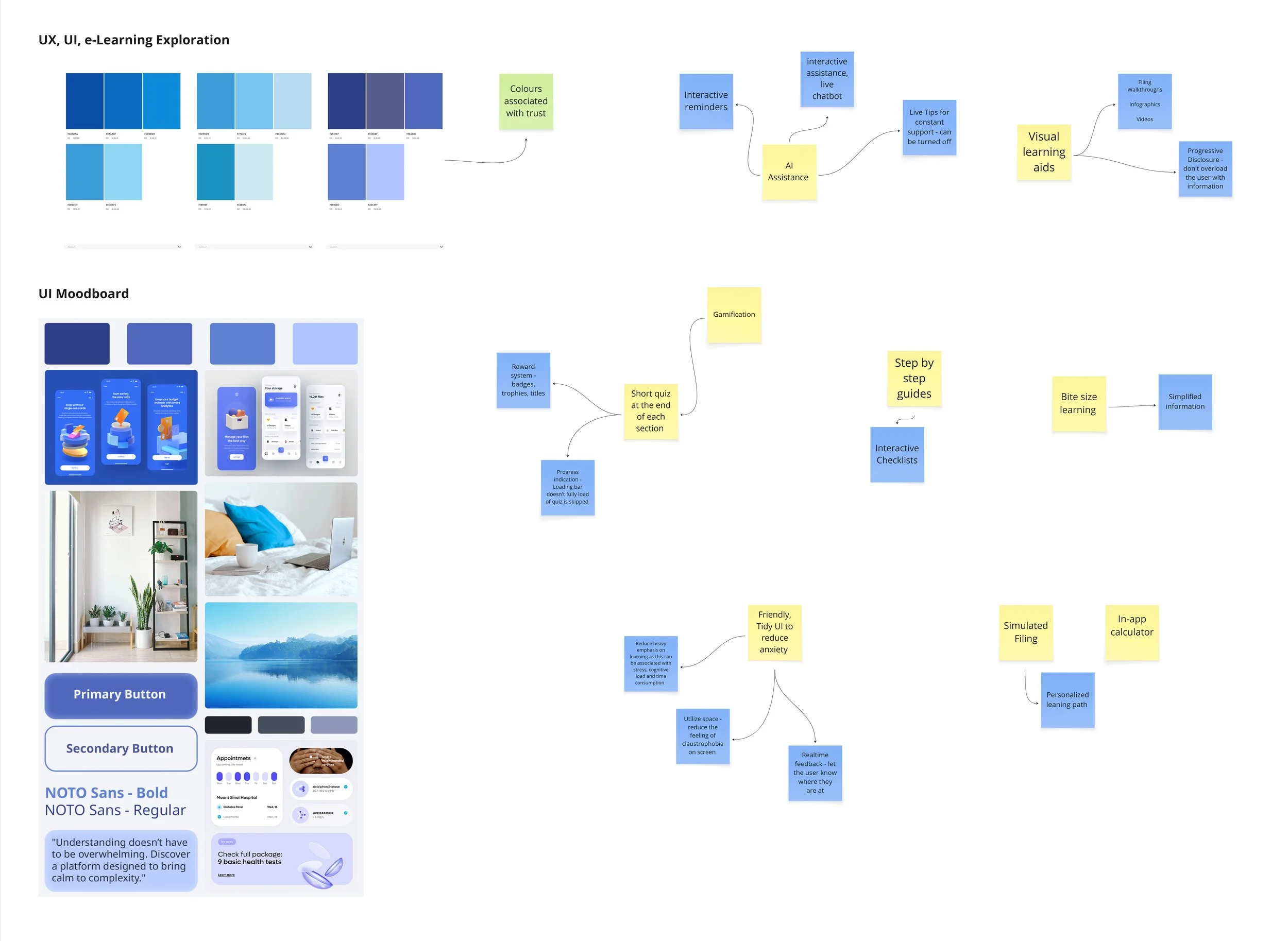
Design Strategy
Early UI exploration focused on three principles: emotional reassurance, progressive disclosure, and instructional clarity. Visual language, colour, and interaction patterns were tested to reduce intimidation while supporting step-by-step learning.
UI Brainstorming
Low-fidelity wireframes were created to validate content hierarchy, navigation logic, and learning flow before visual design. Emphasis was placed on minimizing decision fatigue, surfacing only one primary action per screen, and maintaining continuous user orientation throughout the learning process.
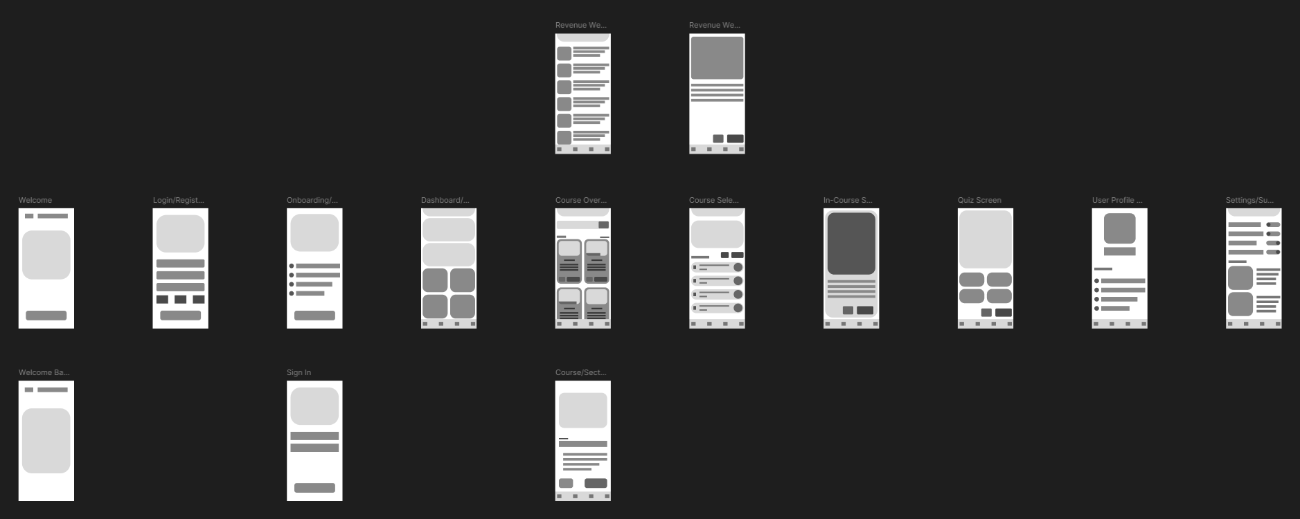
UI Wireframes

UI Screens
High-fidelity mockups translate the validated flow into a calm, supportive interface. Large touch targets, consistent navigation, and contextual guidance were used to lower cognitive load and reduce the fear of making irreversible mistakes identified during research.
SECTION 4: A Closer Look at the UI
This interface was designed to reduce cognitive load, support step-by-step learning, and build user confidence during high-anxiety financial tasks. Micro-interactions (checkmarks, progress bars, completion states) were used deliberately to reduce uncertainty and maintain motivation during complex tasks.
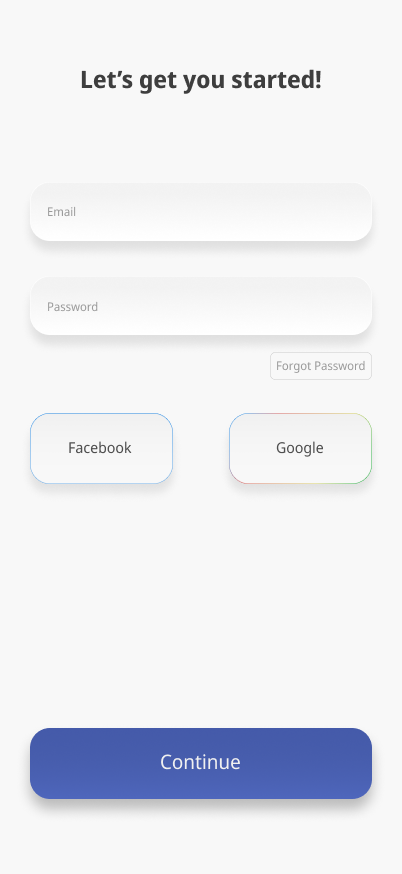
Log in options: Users can use email or social options to create an account.
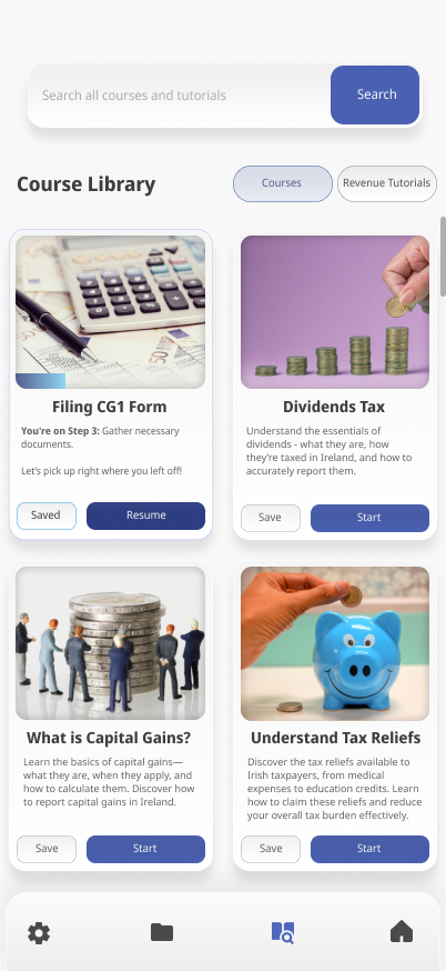
Course Library (Courses): This section is divided into two parts: Courses and Revenue Tutorials. Here, users can browse, save, start, or resume courses that teach various aspects of the Irish tax process. Users can easily switch using the “Courses” and “Revenue Tutorials” button.
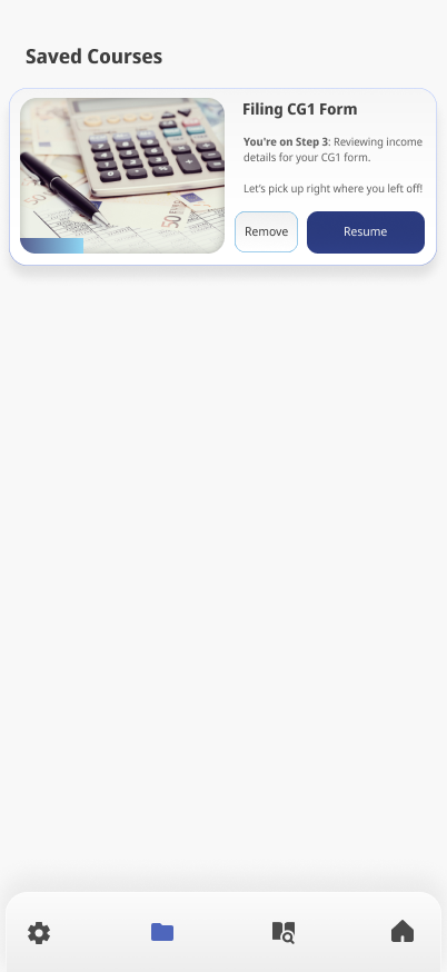

Saved Courses: Courses can be saved by users. From here they can also be removed.
Notifications: From the dashboard the user can access relevant notifications which serve as reminders of important dates and activities.
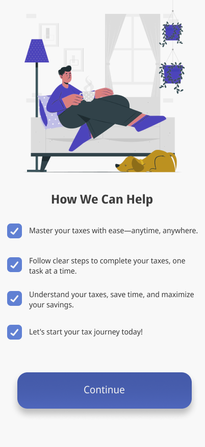
Onboarding screen: Brief messages to a new user about how the app can help them.
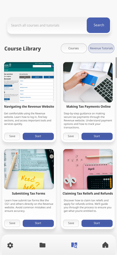
Course Library (Revenue Tutorials): This is the other side of the Course Library offering step-by-step walkthrough tutorials for the revenue website. As users learn about taxes they will need to pay and file them on Revenue.ie.
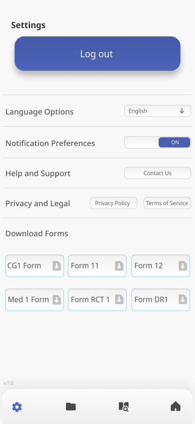
Settings: Here the user is able to log out of their account and find necessary information needed like contacting support, turning off notifications, accessing privacy data, terms of use and downloading relevant tax forms as PDFs which they can fill and file to the Revenue.

Completed Courses: From the dashboard screen the user can access all of their completed courses.
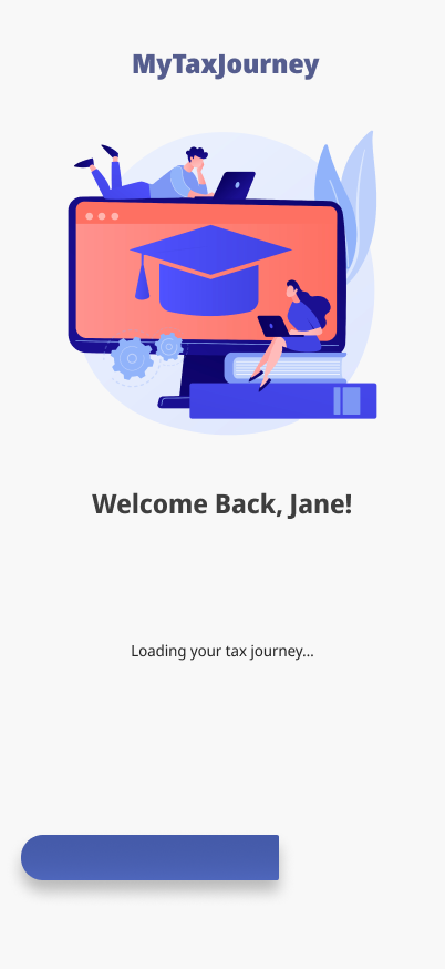
An example of a loading screen for an existing user launching the app.
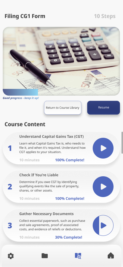

Selected Course: When users tap “Start” or “Resume,” they are taken to a step-by-step course overview. Progress is tracked with a percentage indicator and a progress bar, and the “Resume” button returns users to their last completed step.
Course Complete: After a user has completed every section of a chosen course they are greeted with a congratulations screen and a brief revision message, this could potentially enhance retention of the material covered in the course.
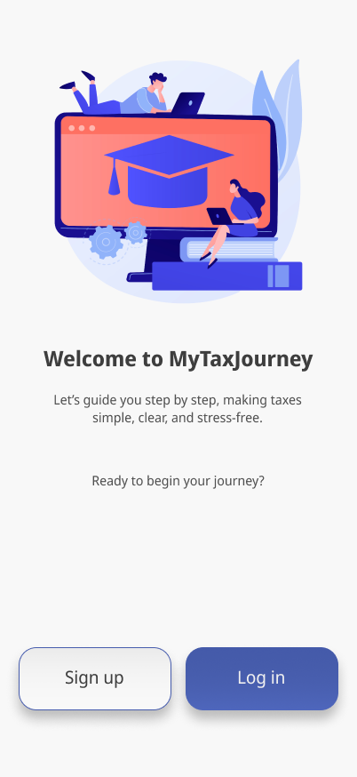
Log in/Sign up: New users sign up and existing users can log in.
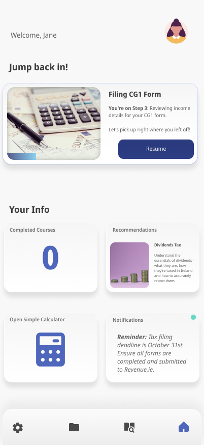
Dashboard: Central hub showing progress, reminders, calculator access, and unfinished learning to reduce task-switching and cognitive overload.
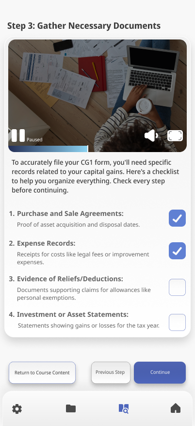

In-Course Screen: In-course experience uses short videos, checklists, and progressive disclosure to prevent information overload.
Simple Calculator: From the dashboard a calculator is available for convenience.
The final design was guided by insights from user interviews, which revealed that financial anxiety stems from both a lack of education and a fear of making errors. This informed the decision to build a tutorial-first interface focused on clarity, support, and micro-interactions to build user confidence.
Section 5: Feedback & Learnings
Due to time constraints, formal usability testing was not conducted. Instead, the concept and key screens were shared informally with a small number of peers to gather early directional feedback. These discussions focused on clarity, perceived usefulness, and overall confidence when approaching online tax tasks.
Key Takeaways
Participants consistently felt that a step-by-step structure would reduce anxiety and make tax tasks feel more manageable.
Progress indicators and clear completion states were seen as reassuring, particularly for users unsure whether they were “doing things correctly.”
The idea of having guidance separate from the official Revenue platforms was viewed positively, as it lowered the pressure associated with making mistakes.
While this feedback was exploratory rather than evaluative, it helped validate the core premise of the project: that structured, plain-language support could make online tax management feel less intimidating.
Future iterations would involve structured usability testing with target users to validate flows, language, and confidence-related outcomes in more depth.